Why did we choose the map projection that we did?
To answer that question, first, we need to dive into the world of cartography.
What is cartography?
Cartography is the study and process of making maps.
It is easy to think that a map is a map. How can there be variance in how you place things on a map? Now that we know that the world is round and we have the technology to take pictures of the earth from space and know precisely where everything is located, how can it be that difficult?.
The difficulty comes when trying to portray something that is spherical (the earth) on a flat surface (the flat map).
Many people have different ideas about the most accurate way to do that, and that is where different map projections come in.
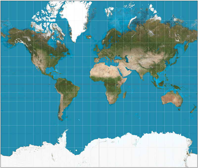
Mercator Projection
This is one of the most popular map projections (used by Google maps and others), created by Flemish cartographer Gerardus Mercator in 1569. This map was designed to be a navigational tool for sailors, and it worked very well for that purpose.
However, in the Mercator projection, the poles are quite stretched. Greenland is shown as roughly the same size as Africa, when in reality Africa is nearly 14 times larger. (TheTrueSize.com is a really neat tool for looking at the relative size of countries.)
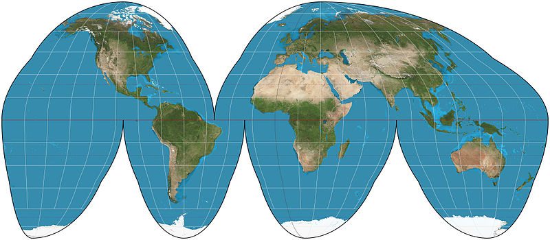
Goode’s Homolosine
You may have seen the map that looks like someone peeled an orange. This projection was developed by John Paul Goode in 1925.
It is good at representing relative size, but it is a bit harder to understand distances between landmasses.
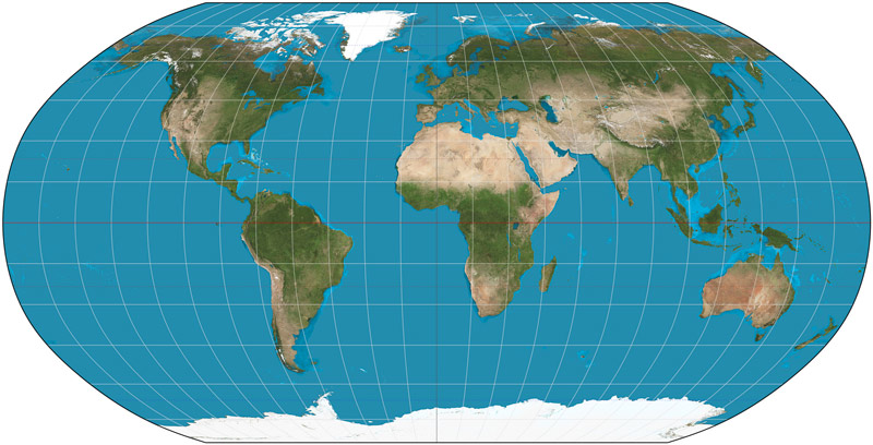
Robinson Projection
In 1963, an American geographer and cartographer named Arthur Robinson came up with a projection that focused on a nice-looking, more artistically appealing map.
With his primary focus on aesthetics, neither the shape nor landmass of the countries is exactly correct.
However, the sizes and shapes remain quite accurate within 45 degrees north and south of the equator. (Forty-five degrees hits in the north across the northern United States and through central Europe, and in the south across central Argentina.) After that, the distortion begins.
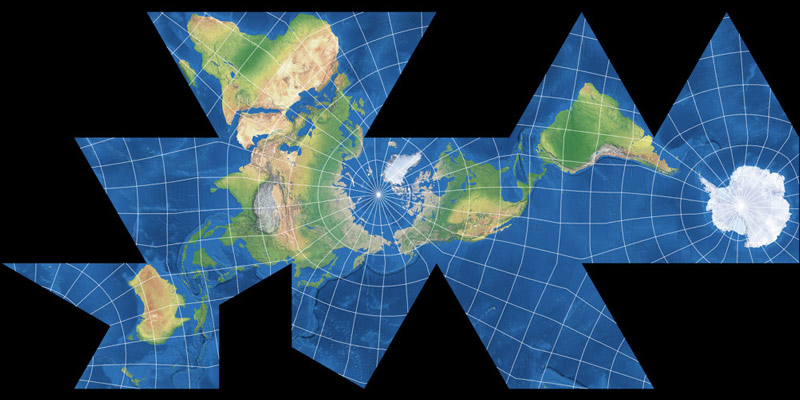
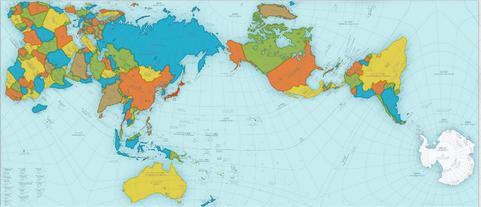
AuthaGraph
This map projection was inspired by the Dymaxion Map of R Buckminster Fuller in 1954 where the world was projected onto the surface of an icosahedron (a 20-faced polyhedron), so it could be unfolded flat. The Dymaxion map’s downfall is that it is quite an odd shape.
The AuthaGraph was made by a Japanese architect, Hajime Narukawa in 1999. He projected his map onto a tetrahedron (a triangular pyramid shape) which then could be unfolded flat into a rectangle.
This projection is one of the most accurate as it keeps the correct proportional size of both continents and oceans.
However, as you can see, it is quite different from the maps we are accustomed to looking at.
These are just a smattering of the most popular. Many people have attempted to accurately portray the map over the years. If you’re interested in exploring different projections, you can check out this neat site to compare map projections.
Why did we choose the map projection that we did?
As you can see, we had some options to choose from.
We wanted a recognizable map image. So, while most accurate, either the AuthaGraph or Dymaxion were not the best for our purposes.
While Goode’s is one of the best in a traditional format at representing accurate size and shape, for our purposes it was also a bit difficult to use.
That left us with Mercator or Robinson.
After looking at the size distortion in the Mercator map, we felt that the Robinson projection, although it has its flaws, was the best compromise for showing a traditional format map that also showed a large portion of the map quite accurate in relative size and shape.

